
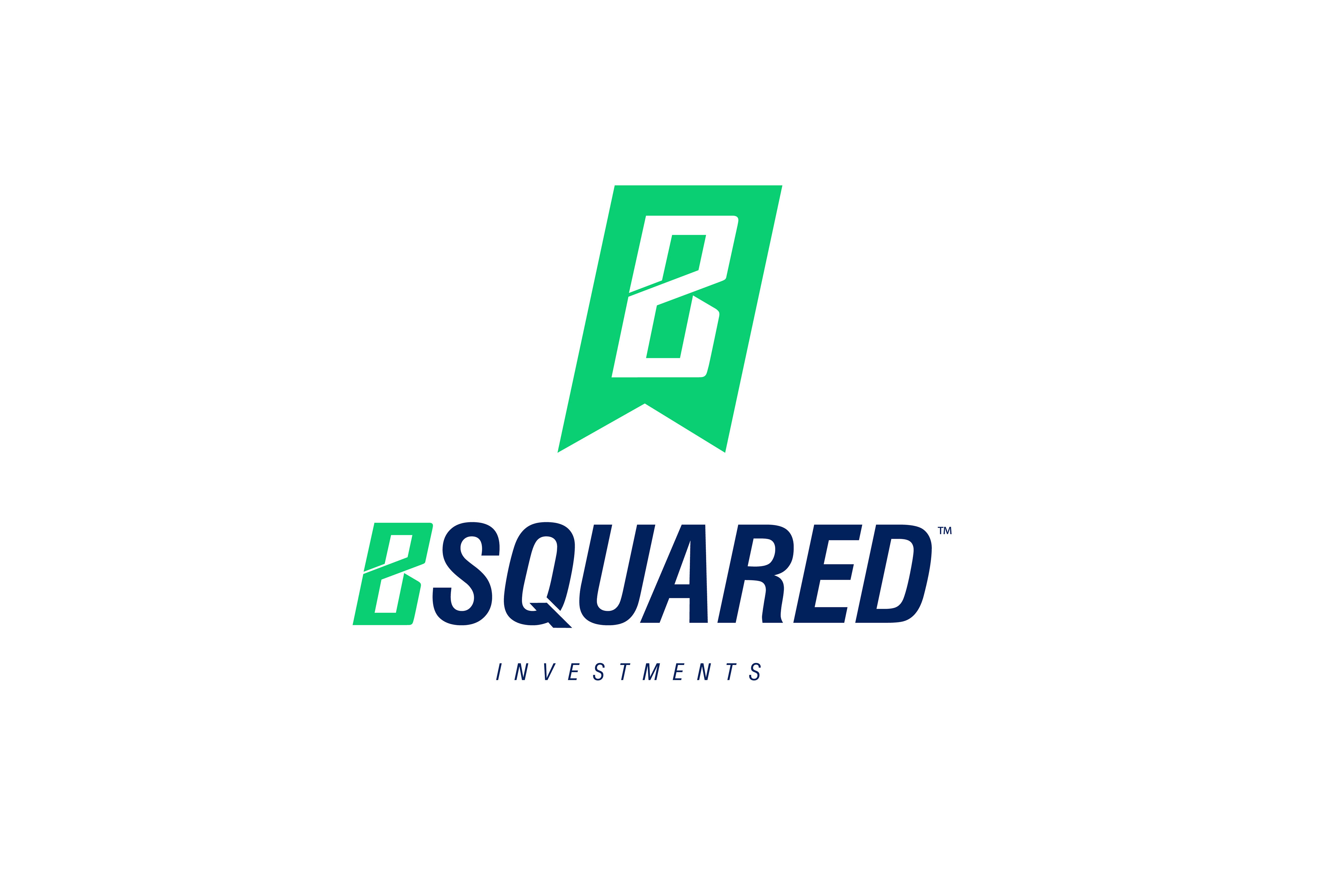
Main Signature Identity
Client Profile: B Squared Investments is a new company in Bend, Oregon that buys, rehabilitates and sells "troubled" or foreclosed homes.
Objective: I was approached to create a logo that spoke credibly to each of their target audiences.
Target Audience: Home sellers in desperate need to sell their homes, Title Companies and Courthouses that might refer them, Lenders looking to invest, and Real Estate Brokers to sell.
Solution: The proposed Identity is Strong and Trustworthy. It communicates Credibility and Quick Responsiveness. It is Approachable yet Professional, and therefore speaks effectively to each audience segment. The icon communicates much of this by itself. The Stylized “B” also forms a “2” which wraps around an “I” formed by the negative space within. The green “ribbon” gives the impression of credibility and leans in “forward progress,” while the negative space at bottom forms the peak of a rooftop. The decision to spell out “B Squared” came when examining the communication of the name. An identity with a “B” and a “2” in the mathematical sense may generate confusion at times if the audience hears the pronunciation “B Squared”. This solution eliminates that possibility. In addition, the use of the word “Squared” can subconciously promote the brand as being “fair and honest”.
Result: The client was very pleased with the final solution.
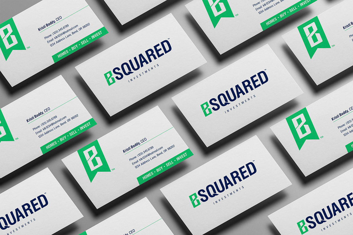
Implementation: Business card concept using both Icon and Wordmark versions of main Identity.

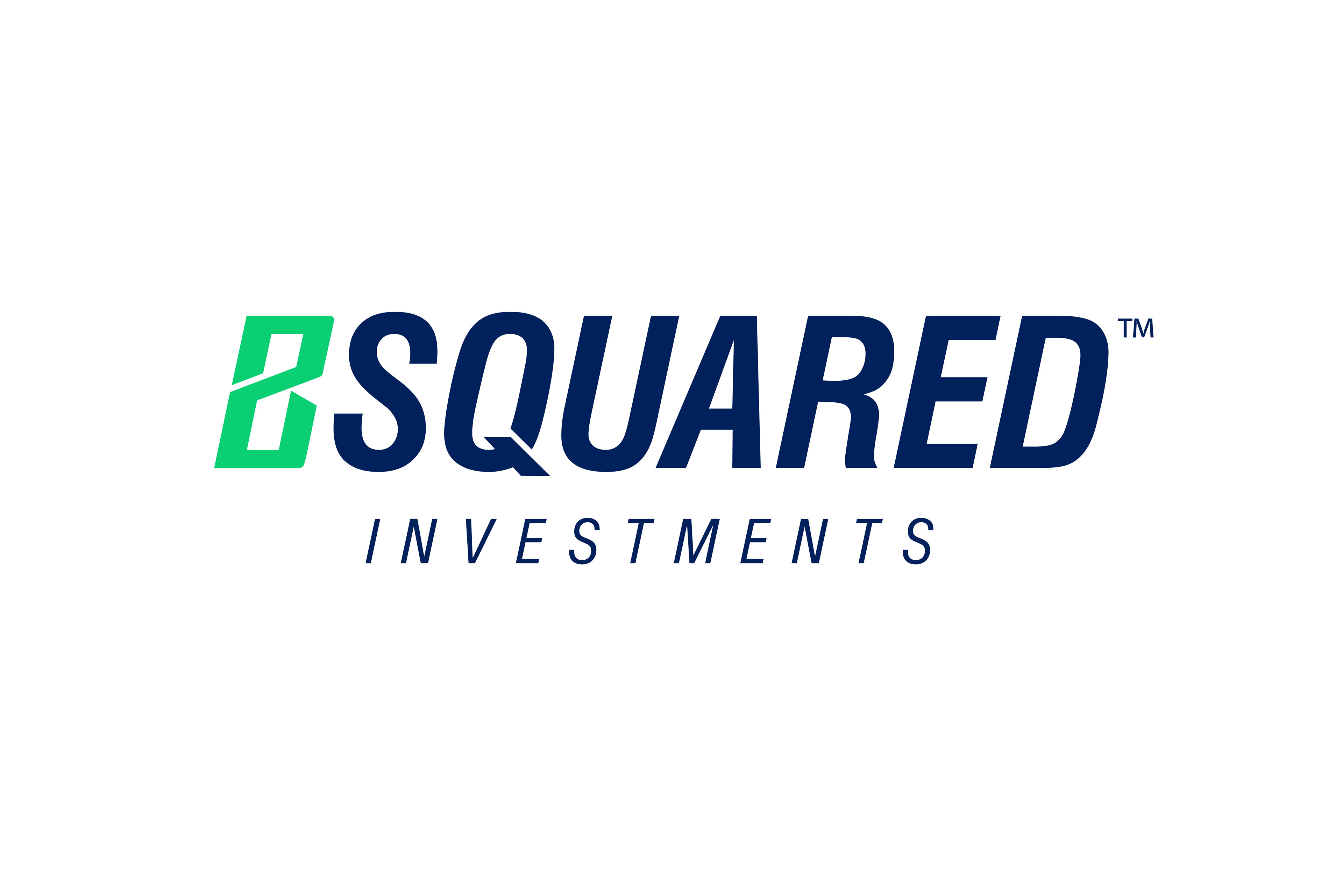
Final Concepts: Icon and Wordmark versions of the Main Identity.
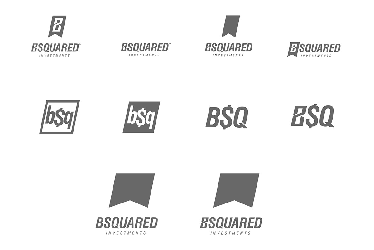
Development: Some of the final candidates vectorized before color treatment.
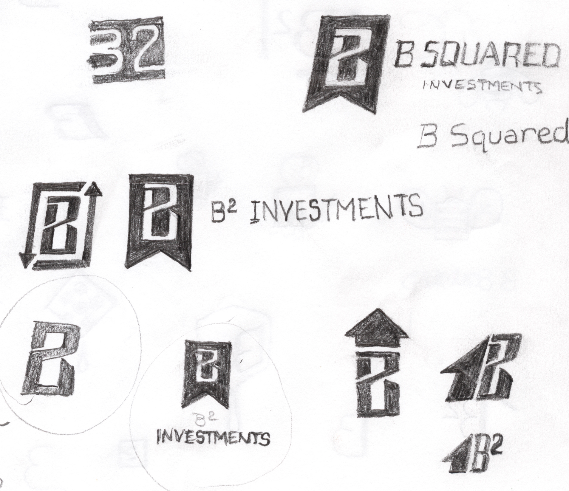
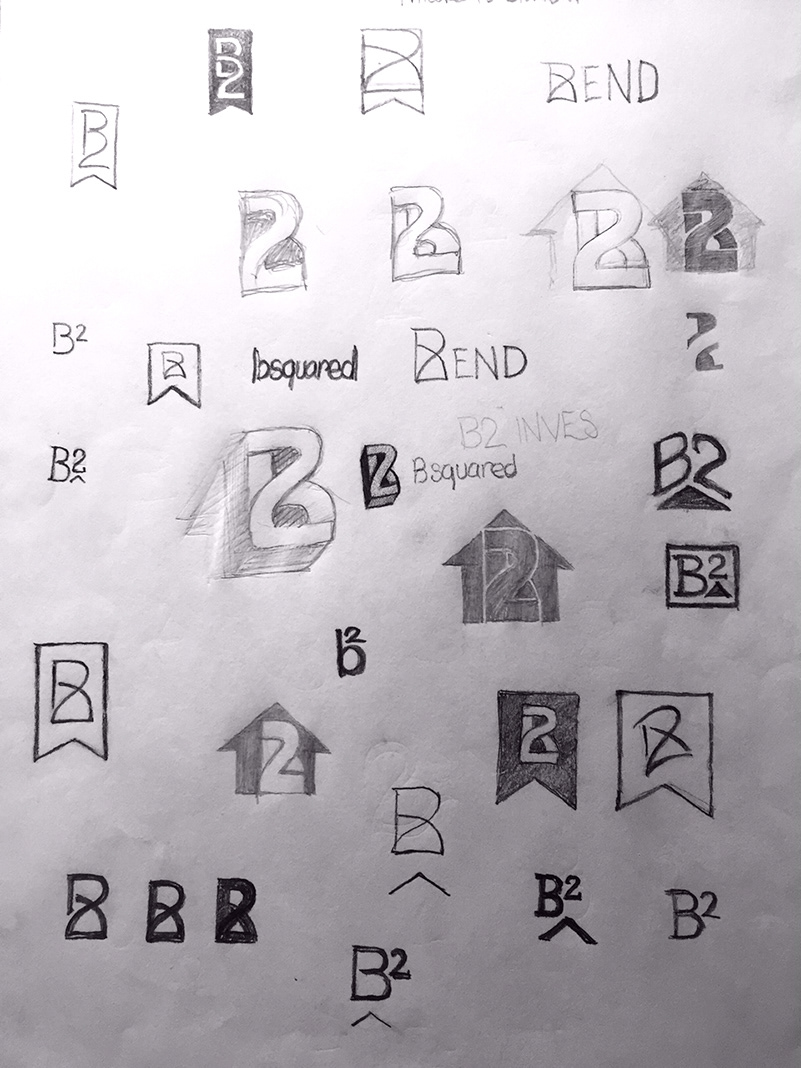
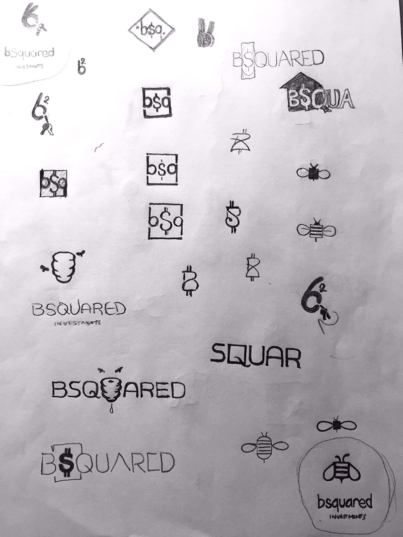
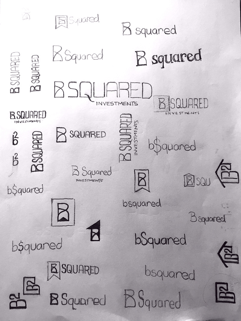
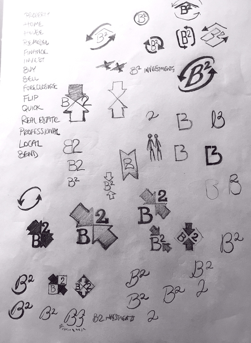
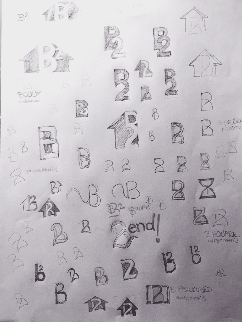
Sketches: Many ideas needed to be quickly fleshed out before rendering on the computer. The key to creativity is not quality, but quantity!