Logomark Design
Client Profile: Joy Centers is an up and coming health and wellness hub rooted in science driven alternatives as well as faith. It's Hybrid approach to healing through a cohesive team offering personalized protocols that engage the body, mind, spirit and emotions for lasting wholeness in a spa-like environment sets it apart from traditional medical facilities.
Objective: I was approached to create a logo that communicated the "essence" of Joy Centers. The objective was to create a "natural and organic feeling of joy" that would be used for brand identification on all signage, web presence and communicative collateral.
Target Audience: Persons of all walks of life looking for a safe place to heal and rebuild.
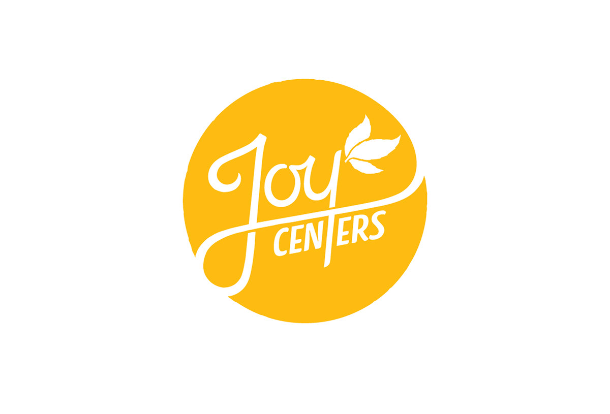
Solution: The word "Joy" was hand-drawn to emphasize the organic/natural feeling that was identified in the creative brief. "Centers" was carefully interwoven with the primary lettering, and the "leaves" are used to convey the natural This color "yellow" was chosen for it's light and joyful hue.
Result: The client was very pleased with the final solution and is looking forward to opening in 2019.
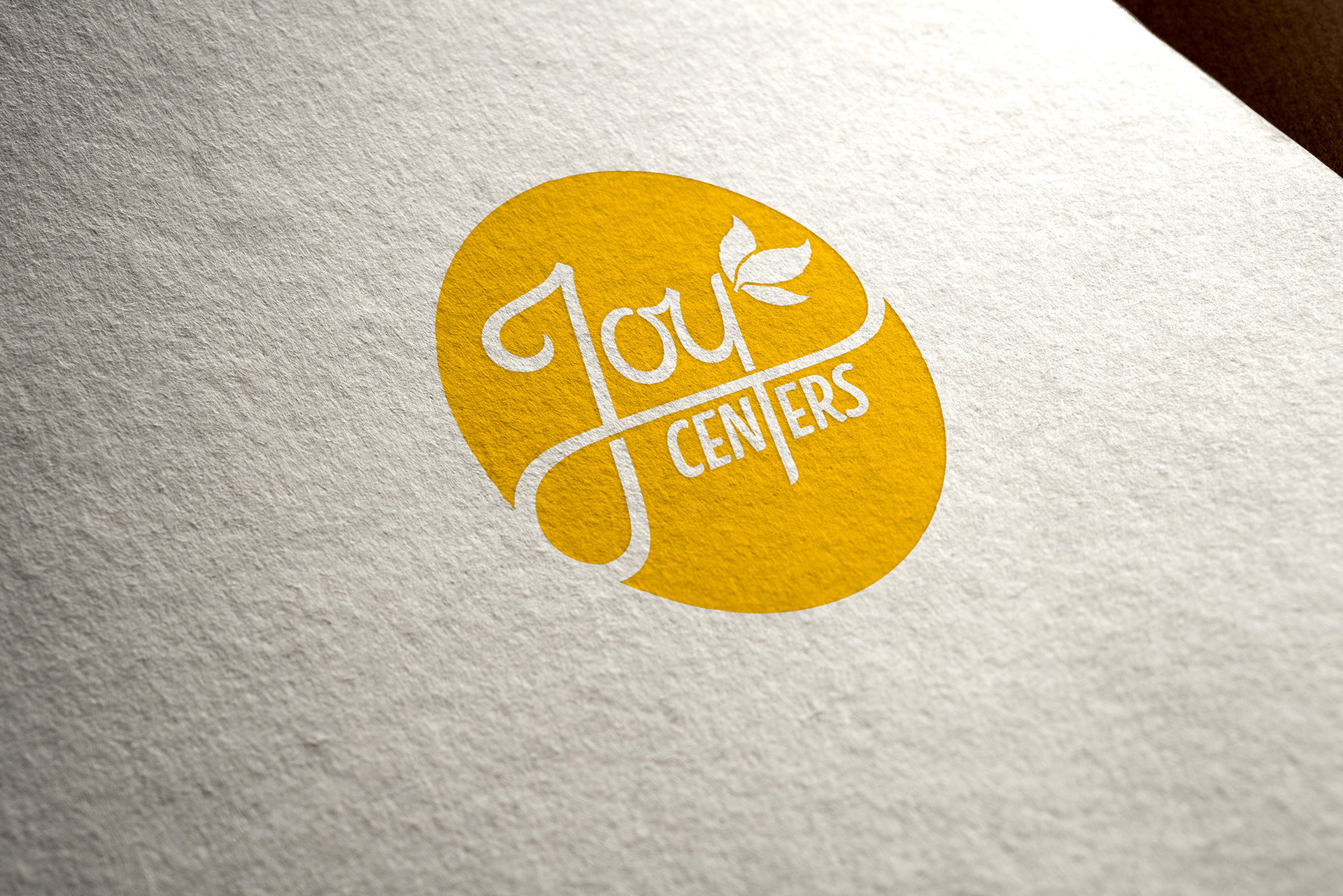
Print: Letterpress notecard mockup.
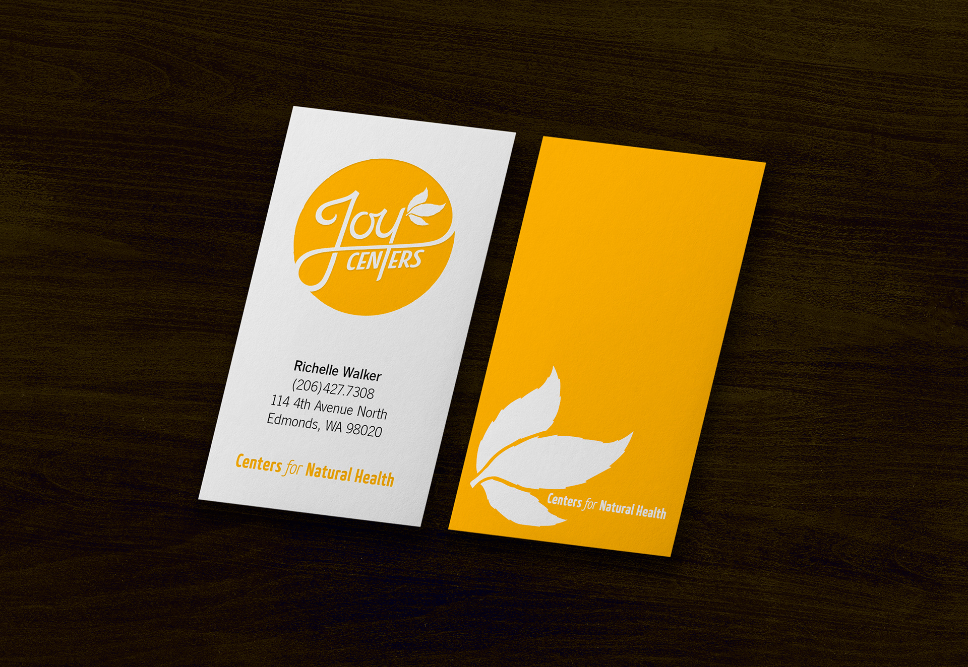
Implementation: The logo shown here on a Double-Sided Business Card.
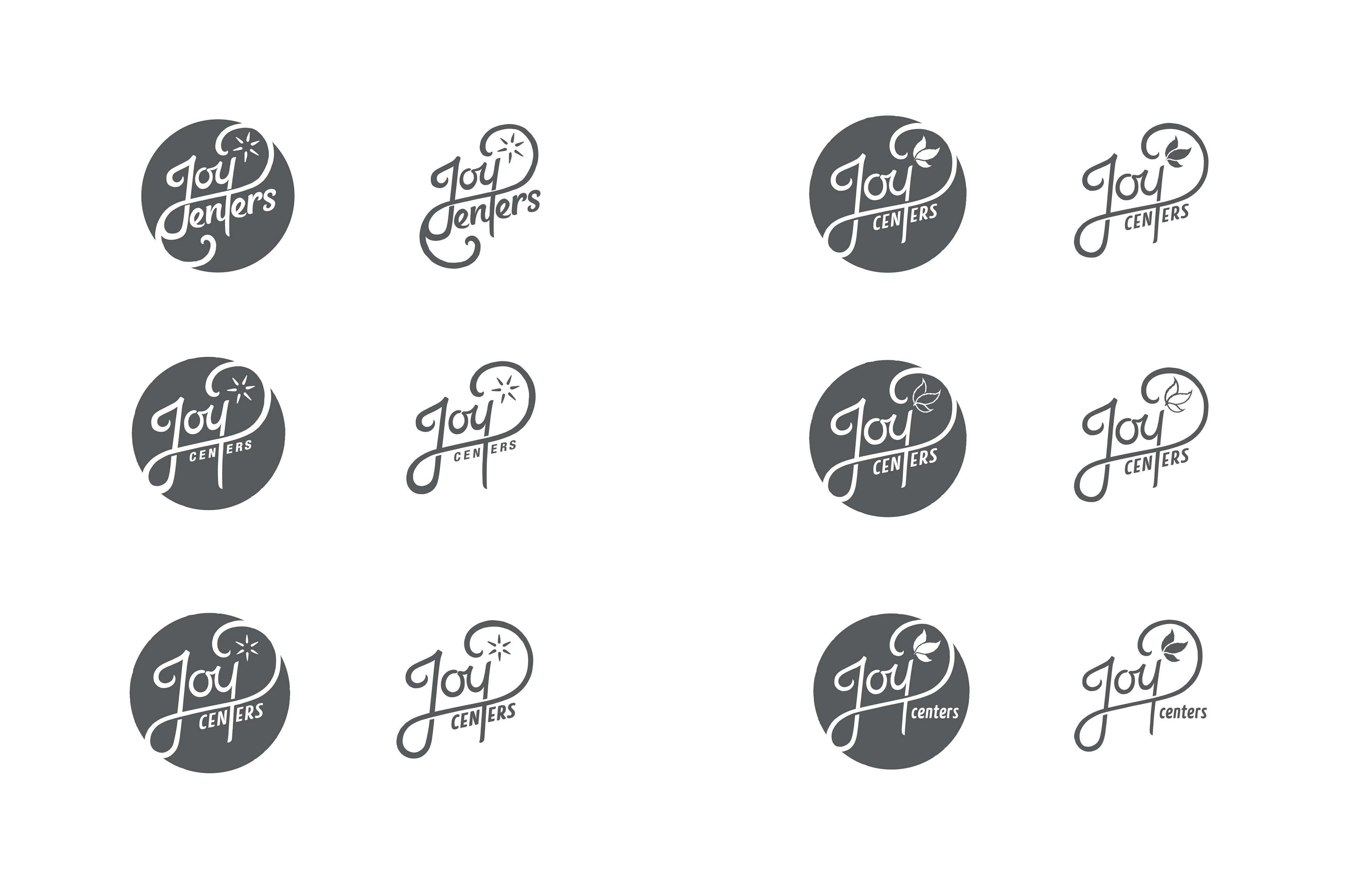
Development: Concept is vectorized refined further.
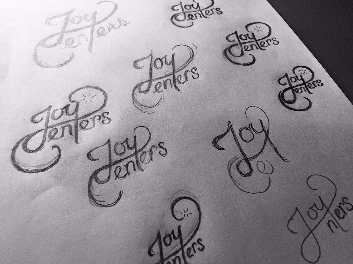
Exploration: Conceptual Sketches.

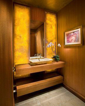

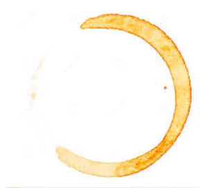

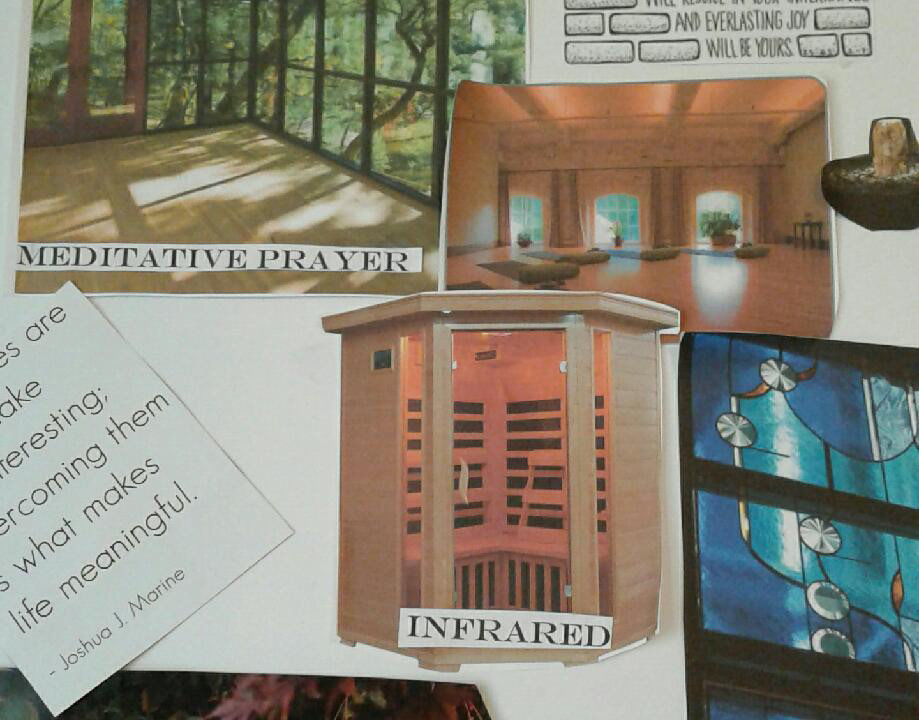

Inspiration: Images that inspired look and feel of the concept.