Overview
The Union is a pro-democracy coalition of grassroots supporters and organizations dedicated to defending our democracy from creeping authoritarianism. The Action Center is a web app based tool we developed that helps pro-democracy minded citizens quickly and easily engage with local organizations to get out the vote throughout the United States.
This project is not only an important project for me as a designer, but as an American citizen and engaged proponent of civic action.
MY ROLE
My role was UI/Visual Designer. I was in charge of UI Pattern Design, Brand Consistency, Iconography and Typographic implementation. I worked hand-in-hand with Developers Scott and Gavin, and our Lead and Principal Angus.
Purpose and ContexT
The Union Action Center is the grassroots tool that we created to point engaged citizens to the political races and actions they can take to promote democracy in their communities and the US commonwealth abroad.
OBJECTIVE
The objective was to create a user-friendly hub for motivated volunteers to access and choose state races and actions for which they could volunteer their time and skills for the immediate election cycle.
I had two problems I needed to solve. The first was visually condensing the robust information index that had been engineered into a quickly accessible and navigable user-interface for mobile and desktop devices - before election day. The second was to convert the earliest iteration to the recently developed "The Union" brand guidelines and develop a set of icons to identify Action Center actions.
MY JOURNEY BEGINS
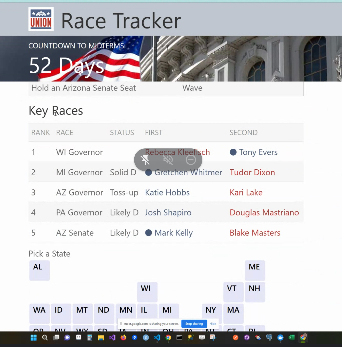
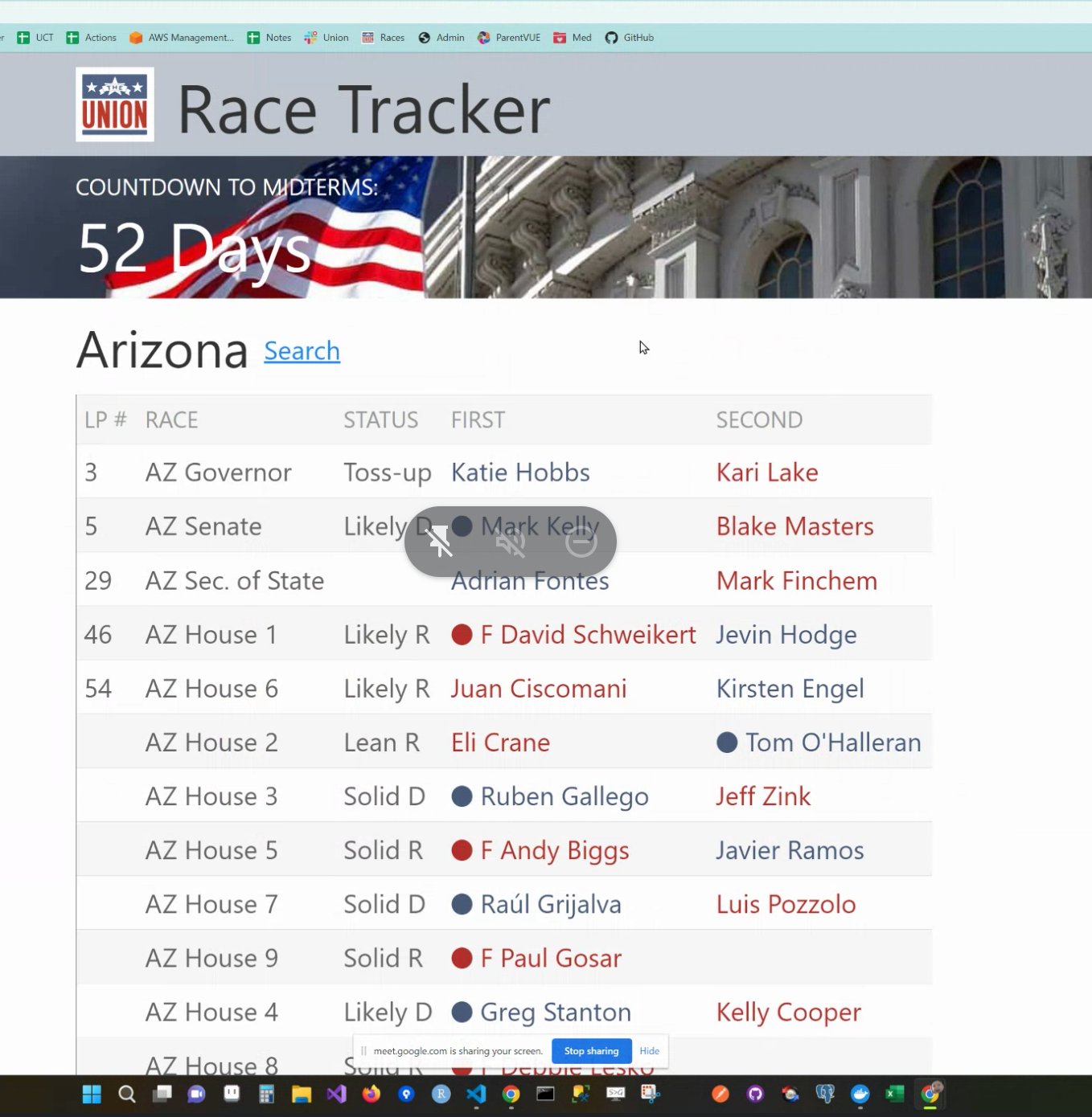
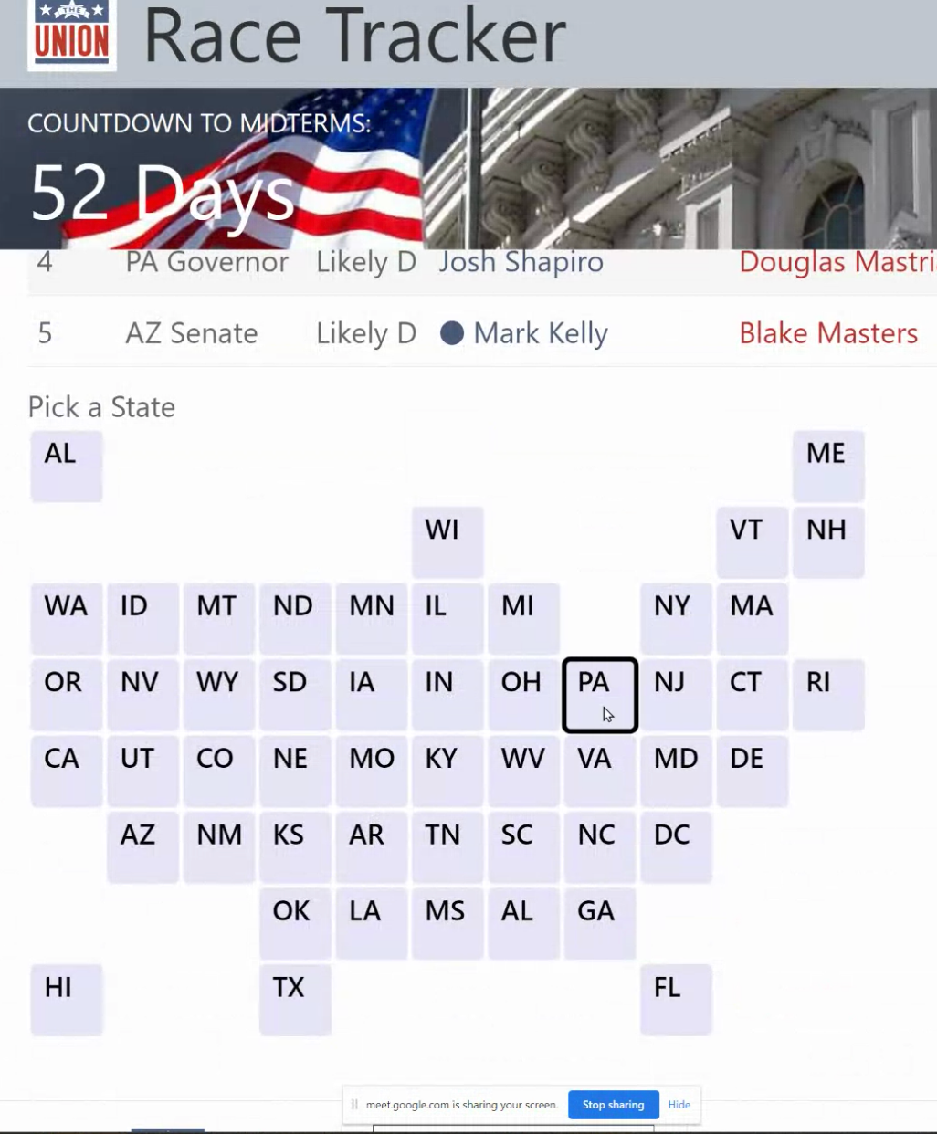
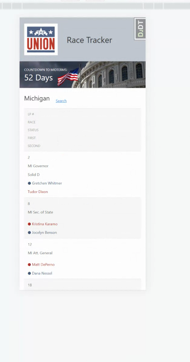
When I first came on board, only weeks away from launch, I immediately noticed a serious problem. There was a LOT of information, but instead of mobile-first design I was looking at a desktop app on my phone!
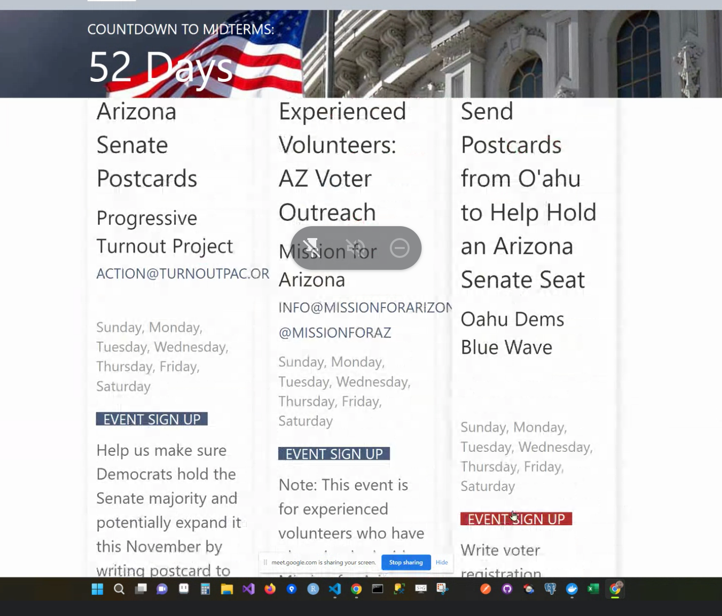
The developers had been working at their desktops, but hadn't realized most people would be interacting with this on their mobile devices. This created the issue of endless scrolling for candidates and races because the information wasn't condensed for mobile consumption. I had my work cut out for me.
First ITERATION
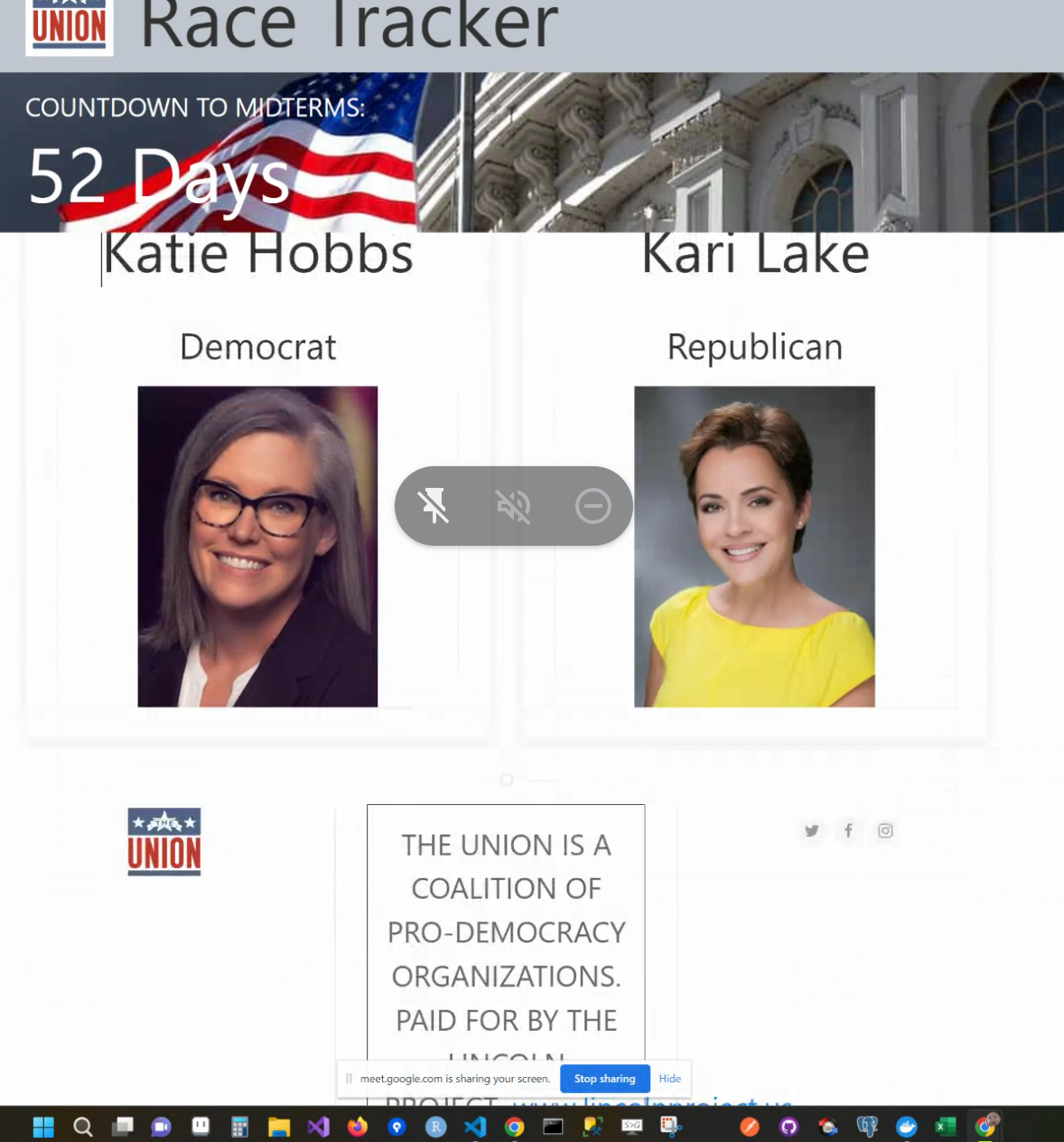
The working name for what would eventually become the Action Center was "race tracker." My first iteration was an attempt at taking the existing format and condensing the information using tab navigation and drop-lists. This would drastically cut the scroll time to a fraction of what it was. In the diagram above you can see the evolution start to take shape.
From there we pivoted to organize the information through "key races" and "key actions" as well as races organized by state - which could be quickly accessed visually by map. That's when I came up with the solution to design distinctive CARDS for each race, action and candidate. For example, Key Action cards would direct the user to a specific action on a partner site, which in many cases offered free training for each volunteer regarding that action.
This led to the development of a Style Guide with each "card" having a distinctive look and feel, each stylized by The Union Brand Guidelines.
SECOND ITERATION
I developed the style guide above based upon The Union Brand Guidelines to create a language of consistency throughout the web app. This really guided the look, feel and function of the UI.
I also developed a set of Icons for the many "Get Out The Vote" actions, including Phone Banking, Text Banking, Postcards, Canvassing and Vote Registering among others.
In addition to the Key Race Cards, Key Action Cards and Candidate Cards, Angus wanted to implement a News Feed, with a selection of credible news story links about each race. Due to legal concerns it was decided that photos would not be used to accompany the article links.
FINAL USER INTERFACE
The final UI allows for quick navigation to Key Actions the user can take and specific State Races that the user may be more invested in learning about or participating in. Although my design was now much better suited for mobile interaction, I also designed the UI for tablet and desktop as well.
RETROSPECT
This project is currently ongoing, and further user testing will be needed to ensure best results. Overall the Action Center had a fairly strong engagement of approximately 1,000 unique visitors and clickthroughs leading up to election day 2022 - which was impressive given that it launched only three weeks prior.
